Bread &Coffee
Exploring how thoughtful product design couldhelp neighborhood bakeries compete digitallythrough trust, clarity and familiarity
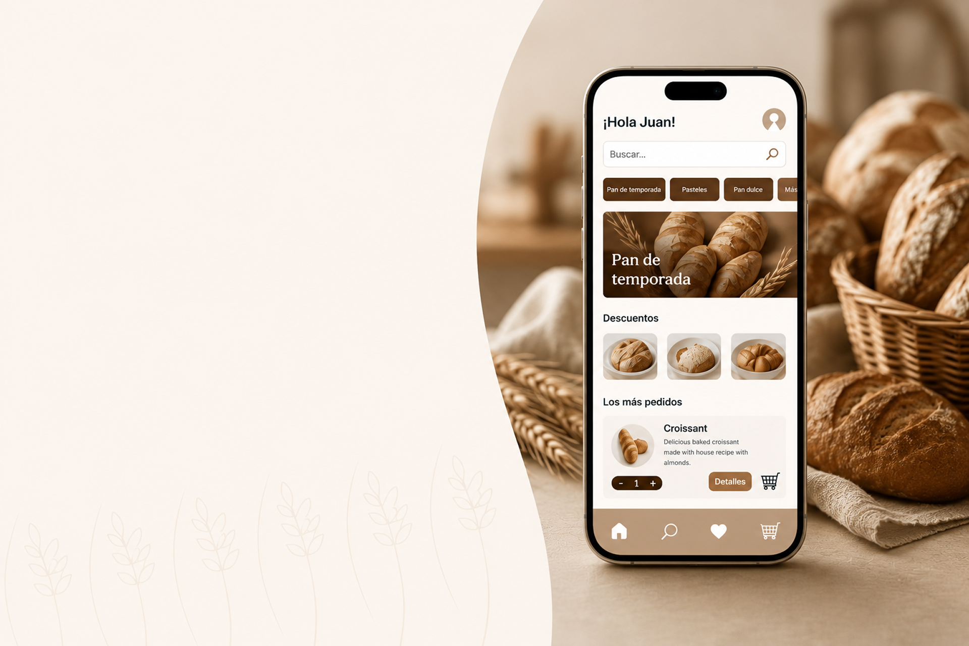
- Role
- Product Designer
- Timeline
- 4 weeks
- Project Type
- Concept Project
- Tools
- Figma
Context
Bread & Coffee was conceived as a digital-first bakery experience exploring how neighborhood bakeries can remain competitive in a world increasingly shaped by delivery platforms—without losing the trust, familiarity and warmth that make them part of everyday life.
Business Opportunity
Neighborhood bakeries face increasing competition from delivery platforms. Many loyal customers still hesitate to order digitally because existing experiences often feel impersonal and difficult to trust.
Design Challenge
Design an ordering experience that gives low-confidence users the reassurance they need while meeting the expectations of digitally fluent customers.
Success Criteria
- Enable independent ordering.
- Reduce hesitation during checkout.
- Increase confidence and trust.
- Encourage repeat purchases.
- Differentiate through familiarity.
Product vision
Bread & Coffee envisions a future where neighborhood bakeries embrace digital commerce without losing the human qualities that make them part of everyday family life.
Research & Insights
A short research phase focused on understanding the tension between digital convenience and the human reassurance people need when ordering from a neighborhood bakery.
Research Question
What makes digital ordering difficult for users with low digital confidence, and what do younger customers expect from a modern bakery experience?
Methods
- User interviews
- Empathy Mapping
- Moderated usability testing
- SUS questionnaire
Core Insight
“People weren't afraid of technology. They were afraid of making irreversible mistakes.”
Participants
5 participants in Mexico City
- 2 Baby Boomers
- 3 Millennials
Key Findings
- Parents value clarity and reassurance over speed.
- Complex flows and too many choices create hesitation.
- Trust is built through transparency and familiarity.
- Families appreciate local, human and warm experiences.
Strategy
Three design principles were established to guide every screen-level decision.
Guidance
A persistent, easy-to-find step-by-step guide and contextual help reduce uncertainty throughout the ordering experience.
Trust
Transparent pricing, clear confirmation states and continuous reassurance help users feel confident before placing an order.
Appetite
Large, high-quality photography and descriptive product information recreate the sensory experience of visiting a neighborhood bakery.
Solution
A guidance-driven experience that makes ordering feel as natural and comfortable as asking for help in person.
Outcome
The redesigned experience is expected to deliver meaningful outcomes for both users and the business.
Designed a self-service ordering experience for users with low digital confidence.
Reframed guidance as a core navigation feature instead of a secondary help tool.
Balanced accessibility needs with the expectations of digitally fluent customers.
Created a scalable concept that could evolve into a real digital product.
Reflections
What I would change today
I would tie every design decision back to specific product metrics and validate the concept with a larger and more diverse sample.
I would also design the guidance mechanism as a modular system and define a clear business model from the start.
Key learnings
Clarity and transparency build more confidence than speed.
Designing for hesitant users improves the experience for everyone.
Embedding a strong emotional connection.
Ponte Botana
Discover how a strategic redesign transformed a local snack brand into a modern digital commerce experience through user research, product strategy and a scalable design system.
